Having mentioned elizabethancostume.net earlier I was idly poking around it on my lunchbreak got absolutely sidetracked by some of the names of the colours documented on the site, not least some lists compiled by Penny Ladnier which are absolutely awesome. I love me a good quirky name, (ask me how I got interested in mushrooms) so I went on a minor sidetrack when I should have been getting back work and had to tear myself away from looking up things like Gingerline (apparently the exact colour of the kumquat fruit), Watchet (a sort of very pale blue with minor green tones) and repeated iterations of a list that included such classics as “Dead Spaniard” (a pale greyish tan), “Rat” (a dull grey), “Scratch Face” (I am dying to know), “Strammel” (red), “Bean’s blue” (a darkish blue, something towards the petrol), as well as “ape’s laugh, smoked ox, merry widow, Resurrection and Mortal sin” (would that I knew). I really hope I can find out more, apparently I need to chase down Elizabethan Costumes from 1550-1580 asap to start.
In our modern world we we routinely get little wedges of colours printed on cards with names like “Heaven’s gate” or “Mystical Sunrise”, I absolutely did not know this was a thing in Elizabethan England, so of course I’ve gone to find out more. I came across Elizabethan England From ‘A Description of England, written by William Harrison, an English clergyman. The Description of England was produced as part of the publishing venture, Holinshed’s Chronicles, in 1577.
I am equal parts interested and amused. He did not mean to be amusing, at all, in fact he does not appear to have been happy with the world and how it was degrading in standards and quality, and he absolutely doesn’t put a tooth in it. I adore finding historical humans voicing complaints about humanity as if that is the first time in history the current generation have been going to the dogs. In the chapter entitled “of our apparel and attire” we get a neat summation of Elizabethean Era Marketing: dressmakers were naming hues in ways “devised to please fantastical heads” Apparently I have a fantastical head, and Mr. Harrison was not pleased with my kind. Clearly I, like people of his time, should have contented myself with a cloak of “brown, blue or puke”! (more on this shortly)
“Neither was it ever merrier with England than when an Englishman was known abroad by his own cloth, and contented himself at home with his fine carsey hosen, and a mean slop; his coat, gown, and cloak of brown, blue, or puke, with some pretty furniture of velvet or fur, and a doublet of sad tawny, or black velvet, or other comely silk, without such cuts and garish colours as are worn in these days, and never brought in but by the consent of the French, who think themselves the gayest men when they have most diversities of jags and change of colours about them. Certes of all estates our merchants do least alter their attire, and therefore are most to be commended; for albeit that which they wear be very fine and costly, yet in form and colour it representeth a great piece of the ancient gravity appertaining to citizens and burgesses, albeit the younger sort of their wives, both in attire and costly housekeeping, cannot tell when and how to make an end, as being women indeed in whom all kind of curiosity is to be found and seen, and in far greater measure than in women of higher calling. I might here name a sort of hues devised for the nonce, wherewith to please fantastical heads, as goose-turd green,peas-porridge tawny, popingay blue, lusty gallant, the devil-in-the-head (I should say the hedge)*, and such like; but I pass them over, thinking it sufficient to have said thus much of apparel generally, when nothing can particularly be spoken of any constancy thereof.”
(CHAPTER VIII. OF OUR APPAREL AND ATTIRE) https://www.gutenberg.org/cache/epub/32593/pg32593-images.html#f161.1
*and after looking these up we have a yellowish green in goose-turd green, a vibrant blue-green in popinjay blue, a slight to red pink in lusty gallant, and a green for devil-in-the-head/hedge
About the closest name to a Dulux or Crown Paints option I found was “Celestial” – I would put money on that existing at the moment. Don’t know what the colour was then, not yet anyway, but apparently it was popular in 1559.
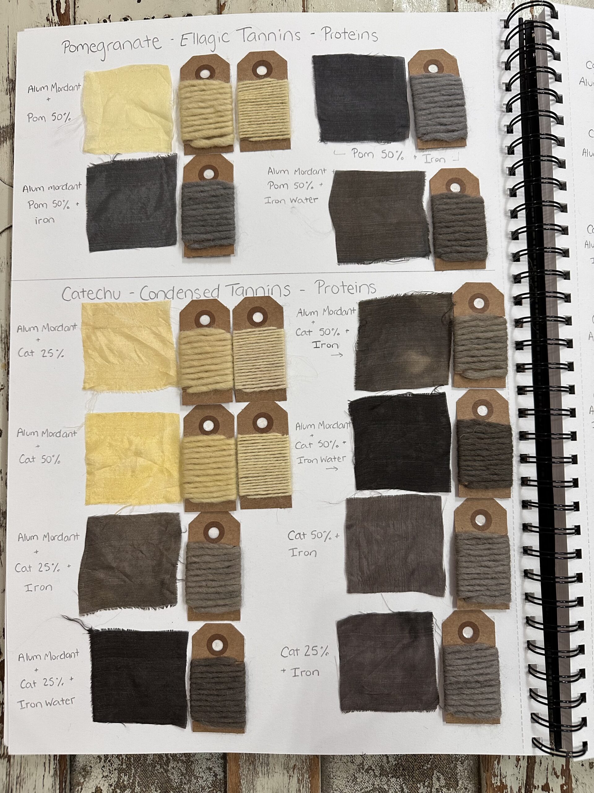
This whole road of fevered name searching came from my initial catching of the colour names “puke” and “goose-turd green”, I mean how could it not? Turns out puke was a high-end wool cloth that was frequently used to make gowns and stockings, and over time the colour name came from the fabric – after a lot of looking up it looks like it’s a small cluster of dark browns that are heading into purple or russet tones, something tannic I suspect. (That’s what Shakepeare’s Puke stocking in Henry IV is, in case you really needed to know.) If at some stage far, far in the future someone is reading this and is wondering why I find the work puke so amusing in this context a) apparently I’m rather childish and b) the word puke now is another name for vomit, which is not a colour I would ever want to wear.

Leave a Reply